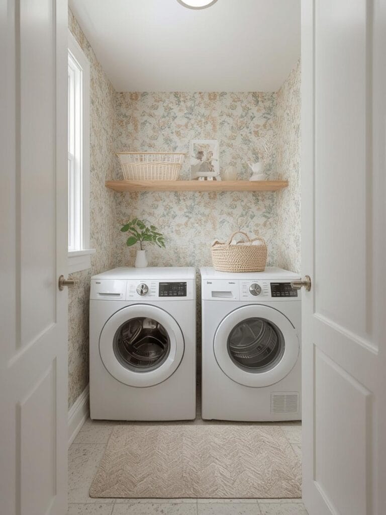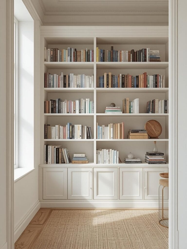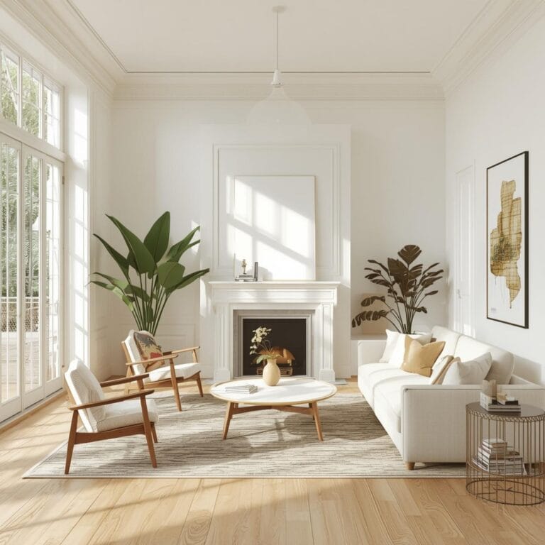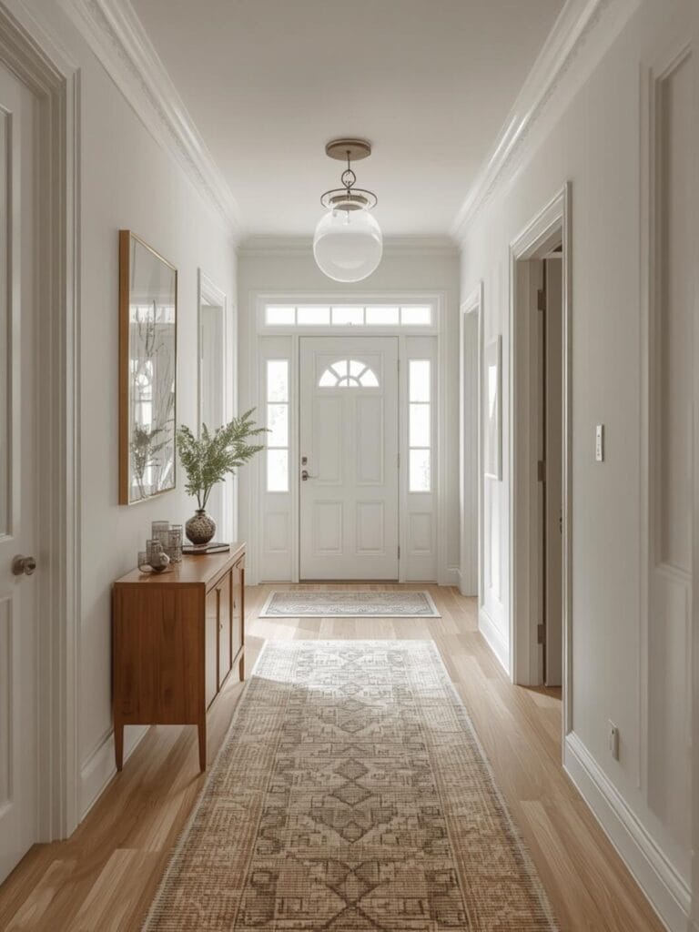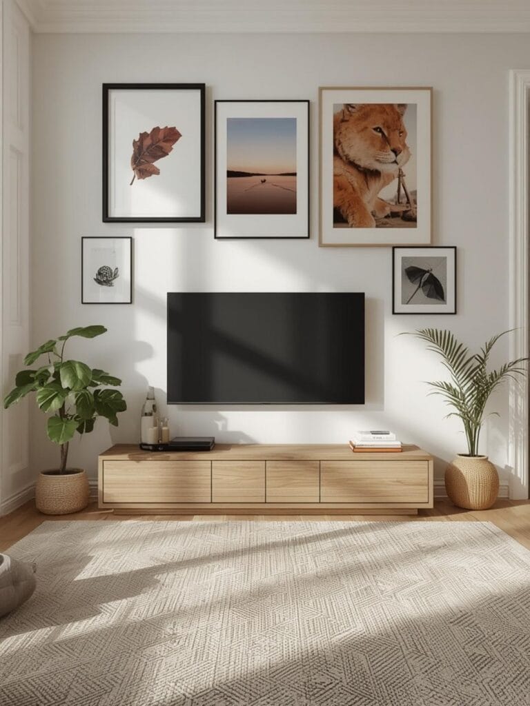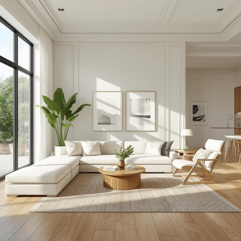
How to Choose Living Room Colors & Styling
You walk into your living room and something feels off. The furniture is fine, the layout works, but the whole space just doesn’t feel like you. Maybe it’s too dark, too bland, or the colors clash in a way you can’t quite put your finger on. You’re not alone in this struggle, and the good news is that fixing it doesn’t require a complete renovation.
Living Room Colors & Styling is one of the most powerful ways to completely change how your home feels without breaking the bank. The right color palette can make a cramped space feel airy, a cold room feel cozy, or a boring space feel vibrant and full of personality. Your living room is where life happens—movie nights, coffee with friends, quiet Sunday mornings—so it deserves to feel just right.
In this guide, you’ll discover how to choose colors that actually work together, create the mood you want, and make your living room a place you’re genuinely excited to spend time in.
Table of Contents
What You’ll Need to Get the Look
Creating a cohesive color scheme doesn’t require professional help or expensive tools. You just need the right elements and a clear vision of what you’re trying to achieve.
Paint and wall color samples are your starting point. Grab sample pots in colors you’re considering and paint large swatches on your walls. Light changes throughout the day, so live with those samples for at least 48 hours before committing.
Textiles and soft furnishings bring your color scheme to life. Think throw pillows, blankets, curtains, and area rugs. These are easy to swap out seasonally or when you want a fresh look without repainting.
Accent pieces and decor tie everything together. Picture frames, vases, books, candles, and artwork should complement your main color palette. You don’t need to match everything perfectly—harmony is better than uniformity.
Furniture in complementary tones anchors your color story. Your sofa, chairs, and coffee table set the foundation that everything else builds upon.
Lighting fixtures affect how colors appear in your space. Warm bulbs make colors feel cozy, while cool bulbs create a crisp, modern feel.
Finding Your Style and Season
Your living room color choices should reflect both your personal style and how you actually use the space. Are you drawn to calm neutrals or energizing brights? Do you entertain often or prefer quiet evenings at home?
Spring and summer inspire lighter, breezier palettes. Soft whites, pale blues, sage greens, and buttery yellows create an airy feel perfect for longer days and open windows. These seasons are ideal for refreshing your space with new energy.
Fall and winter call for deeper, richer tones. Warm terracottas, forest greens, navy blues, and earthy browns make your living room feel like a cozy retreat when it’s cold outside.
Your lifestyle matters too. If you have kids or pets, darker accent walls or patterned rugs hide wear better than stark white everything. If you work from home and your living room doubles as an office, calming colors help you stay focused.
Natural light in your space is the biggest factor most people overlook. North-facing rooms stay cooler and benefit from warm tones. South-facing rooms get plenty of light and can handle bolder, darker colors without feeling cave-like.
7 Ideas to Try in Your Home
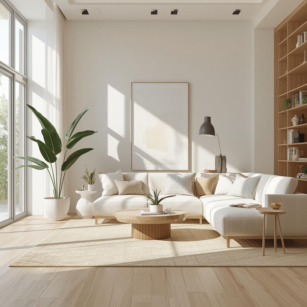
Ready to see how different approaches work in real homes? These ideas range from subtle to bold, so you’ll find something that matches your comfort level.
The Monochromatic Approach uses different shades of the same color family. Try various tones of gray, beige, or blue throughout your room. It’s sophisticated and nearly impossible to mess up. Your walls might be a soft dove gray while your sofa is charcoal and your pillows range from light to medium gray.
Warm Neutrals with Natural Textures combine creamy whites, soft tans, and warm beiges with wood, linen, and jute. This creates an organic, relaxed feel that works beautifully in any home style. Add greenery for pops of life without overwhelming color.
Neutral paint colors that make small living rooms feel bigger include soft white, pale gray, light beige, and barely-there blue. These shades reflect light rather than absorb it, which visually expands your space. Paint your trim the same color as your walls to eliminate visual breaks that make rooms feel chopped up.
The Classic Navy and White Combo brings timeless elegance to your living room. Use navy as an accent wall or in your furniture, balanced with crisp white walls and natural wood tones. Add brass or gold hardware for extra sophistication.
Earthy Greens and Terracotta create a grounded, nature-inspired palette that feels both trendy and timeless. Sage green walls pair beautifully with terracotta pillows, rust-colored throws, and plenty of plants. This combination works especially well in homes with lots of natural materials.
Soft Pastels for a Gentle Touch aren’t just for nurseries. Dusty rose, powder blue, mint green, and lavender create a calming, romantic atmosphere when used with restraint. Keep walls in the palest version and use deeper pastels in accessories.
Bold Jewel Tones as Accents add drama without overwhelming. Keep walls neutral and bring in emerald green, sapphire blue, or deep plum through one statement piece—a velvet sofa, a large piece of art, or dramatic curtains. Balance bold colors with plenty of neutrals.
Benefits of Getting Your Colors Right
When your living room colors work together harmoniously, the benefits go way beyond just looking good. You’ll actually feel different in your space.
Your mood improves because color psychology is real. Blues and greens calm you down after stressful days. Warm yellows and oranges energize you and make spaces feel welcoming. The right colors support how you want to feel at home.
Your space feels larger or cozier depending on what you need. Light colors expand small rooms while darker tones make huge spaces feel more intimate and comfortable.
Everything looks more expensive when colors are coordinated properly. A thoughtful color scheme makes budget furniture look high-end and creates a polished, intentional appearance that impresses guests.
Your home reflects your personality instead of looking like a generic showroom. The colors you choose tell your story and make your living room uniquely yours.
Future decorating becomes easier once you’ve established a color palette. You’ll know exactly what works when shopping for new pillows, rugs, or artwork.
Tips, Alternatives, and Styling Advice
You don’t need an unlimited budget to create a beautiful color scheme. Here’s how to approach it at different price points.
Budget-friendly option: Start with paint, which gives you the biggest impact for the least money. Keep furniture neutral and inexpensive, then add color through thrift store finds, DIY artwork, and affordable textiles from discount stores. Rearrange what you already own in new ways.
Mid-range option: Invest in one quality piece of furniture in your desired color—maybe a really good sofa in the perfect shade. Paint your walls and add coordinating curtains, a nice area rug, and several throw pillows. Mix high and low pieces strategically.
Premium option: Hire a color consultant for a few hours to create a professional palette, invest in designer paint like Farrow & Ball or Benjamin Moore’s premium lines, and choose high-quality furniture in exactly the right shades. Add custom window treatments and original artwork.
Small space adaptation: Stick to lighter shades that reflect light, but don’t be afraid of one darker accent wall to add depth. Use mirrors strategically to bounce light around. Keep your color palette limited to three main shades to avoid visual clutter.
Test before committing: Never choose paint based on a tiny chip. Buy samples, paint poster boards, and move them around your room throughout the day. Colors look completely different in morning versus evening light.
Common Mistakes to Avoid
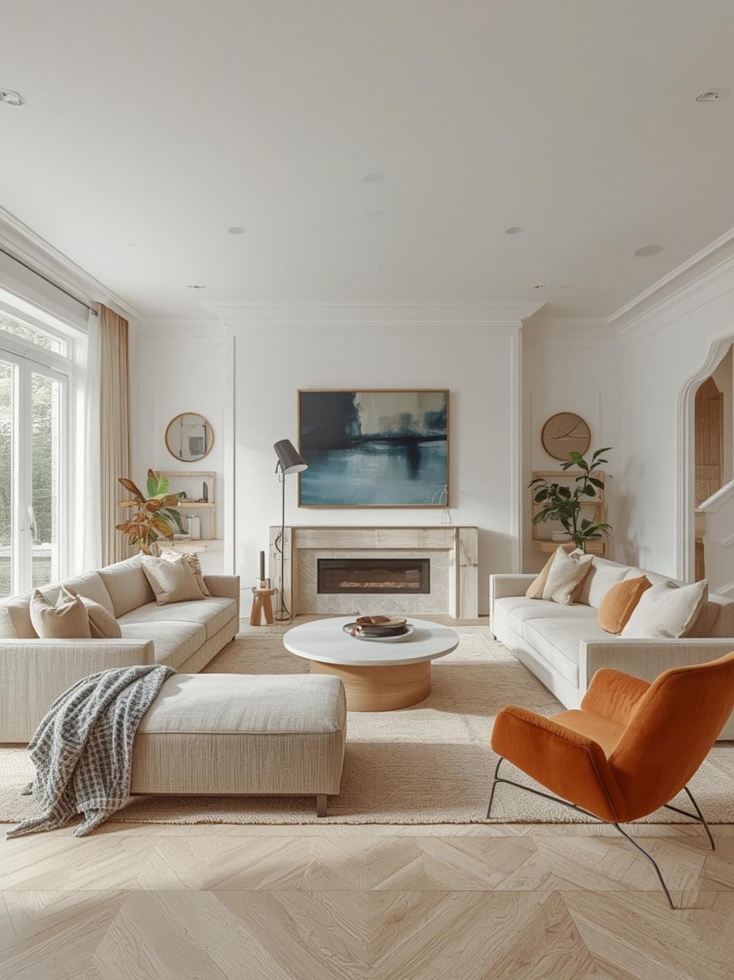
Even with the best intentions, certain missteps can throw off your whole color scheme. Here’s what to watch out for.
Choosing paint colors first and everything else second leads to frustration when you can’t find furniture to match your walls. Instead, start with your largest furniture piece and build your palette around it since furniture is harder to change than paint.
Ignoring undertones makes colors clash unexpectedly. That “gray” might be actually blue-gray or greige, which won’t work with your warm beige sofa. Always check undertones by comparing colors side by side in your actual lighting.
Going too matchy-matchy creates a flat, showroom look with no personality. Your blues don’t all need to be identical—varied shades in the same family add depth and interest.
Forgetting about your fixed elements like flooring, countertops, and built-ins is a costly mistake. Your color scheme must work with these permanent features you can’t easily change.
Painting your entire room before testing is the biggest gamble. That perfect color at the store might look terrible in your space, and you won’t know until you’ve already done all the work.
Maintenance and Upkeep Tips
Keeping your color scheme looking fresh doesn’t require constant work, but a little regular care goes a long way.
Rotate your textiles seasonally to keep things feeling fresh. Store away heavy winter throws and darker pillows in summer, swapping them for lighter options. This also makes your investment pieces last longer.
Touch up paint annually in high-traffic areas where walls get scuffed. Keep leftover paint labeled with the room and date so you can do quick fixes without repainting everything.
Refresh your neutrals every few years since white and light colors yellow over time, especially in rooms with lots of sunlight. A fresh coat of your neutral base color makes everything else look better too.
Clean your upholstery regularly to maintain color vibrancy. Vacuum weekly and treat spills immediately. Many stains become permanent if left too long.
Protect from sun damage by using UV-filtering window treatments. Direct sunlight fades fabrics, artwork, and even painted walls over time.
Your Living Room, Your Way
Getting your living room colors right is one of the most satisfying home improvements you can make. The transformation happens relatively quickly, costs less than most renovations, and makes an immediate difference in how your whole home feels.
Start with one element you love—maybe it’s a rug you can’t stop thinking about or a paint color you saw in a friend’s house. Build your palette from there, testing as you go and trusting your instincts. Your living room should make you happy every single time you walk into it.
Ready to explore more ways to make your living room incredible? Visit DecorKingdom for hundreds of ideas, guides, and inspiration for creating a home you absolutely love.
FAQs
What’s the easiest way to choose living room colors if I’m scared of making a mistake?
Start with a neutral base on your walls—soft white, warm beige, or light gray—then add color through easily changeable elements like pillows, throws, and artwork. This lets you experiment without commitment. Once you find colors you love in accessories, you can consider bolder choices for walls or furniture.
How many colors should I use in my living room to avoid it looking too busy?
Stick to a maximum of three to four main colors, following the 60-30-10 rule: 60% dominant color (usually walls and large furniture), 30% secondary color (accent furniture and curtains), and 10% accent color (decorative accessories). This creates balance without overwhelming your eyes.
Can I mix warm and cool colors in the same living room?
Yes, but it requires balance. Choose one temperature as your dominant theme and use the other sparingly as accents. For example, if your room is mostly warm beiges and terracottas, add just a few cool blue pillows for contrast rather than making blue a major element.
Do I need to repaint my whole living room to change the color scheme?
Not at all. Sometimes one accent wall makes all the difference, or you can keep neutral walls and completely change your room’s feel by switching out textiles, adding new artwork, and rearranging furniture. Paint is powerful but it’s not always necessary.
What colors make a living room feel cozy versus energizing?
Warm colors like terracotta, rust, warm browns, and golden yellows create cozy, intimate feelings. Cool colors like bright white, crisp blue, and fresh green feel more energizing and open. For balanced energy, combine warm and cool tones rather than going all one direction.
—
Meta Title: Living Room Colors & Styling Ideas That Work in 2026
Meta Description: Choose perfect living room colors and styling that reflect your personality. Get inspired with practical color palette ideas for any space.