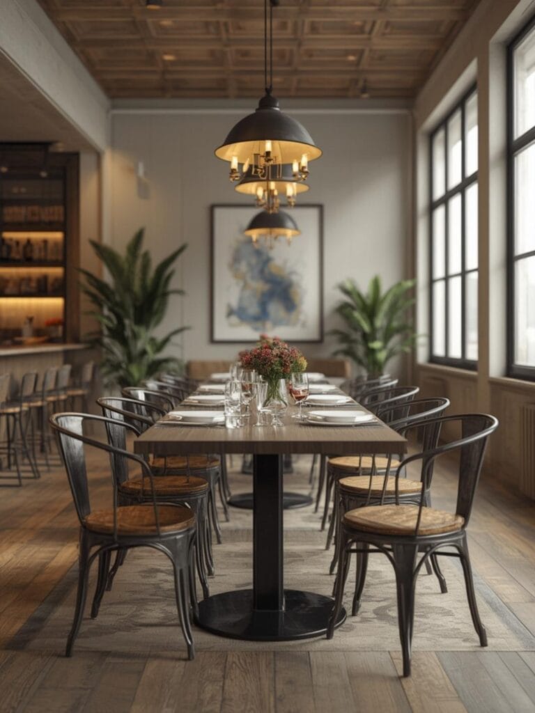
How to Choose Two Color Combinations for Living Room
You’ve repainted your living room three times this year, and somehow it still feels off. Maybe the walls look great in morning light but seem drab by evening. Or perhaps the room feels smaller and more cramped than before. The problem isn’t your taste or your effort—it’s that two color combinations for living room spaces require more than just picking pretty shades from a paint chip.
Most homeowners think choosing two colors means selecting their favorites and hoping they work together. But your living room is where your family gathers every evening, where guests form their first impression of your home, and where you spend countless hours relaxing. Getting the color balance right changes everything about how the space feels and functions.
The good news? You don’t need a design degree to create a living room that feels cohesive and inviting. You just need to understand a few simple principles about how colors work together in real living spaces.
Table of Contents
What You’ll Need to Get the Look
Creating a well-balanced two-color living room starts with the right elements in place:
Paint and Application:
– Two complementary paint colors in your chosen finish (typically one gallon per color for average-sized rooms)
– Paint samples in both colors
– Painter’s tape for clean lines
– Quality brushes and rollers
– Drop cloths to protect flooring
Furniture and Fabrics:
– Sofa or sectional that coordinates with your color scheme
– Accent pillows in both paint colors
– Curtains or window treatments
– Area rug that ties both colors together
– Throw blankets for layering
Decorative Accents:
– Wall art featuring your color palette
– Decorative objects like vases or bowls
– Table lamps with coordinating shades
– Picture frames in neutral tones
– Plants to add natural contrast
Finding Your Style and Season
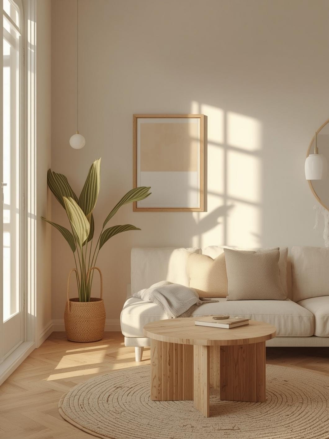
Your color combination should reflect both your personal style and how your living room functions throughout the year.
Consider Your Natural Light:
South-facing rooms get warm, bright light all day, so they can handle cooler color combinations like navy and cream or sage and white. North-facing rooms receive cooler, dimmer light and benefit from warmer pairs like terracotta and beige or gold and ivory.
Test your paint samples on different walls at various times of day. Morning, afternoon, and evening light can dramatically change how colors appear and interact with each other.
Think About Room Usage:
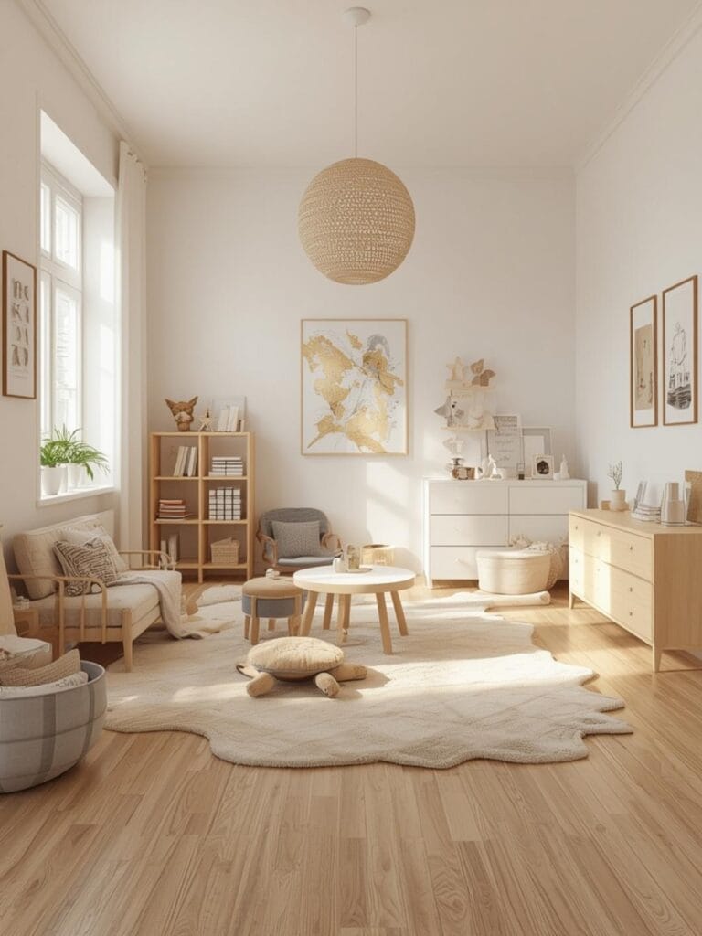
A living room used primarily for entertaining guests might call for more sophisticated combinations like charcoal and blush or forest green and cream. Family rooms where kids play and everyone relaxes work better with forgiving, cheerful pairs like light gray and soft yellow or powder blue and white.
Seasonal Flexibility:
Choose a combination that feels right year-round, not just one season. Neutral bases paired with adaptable accent colors work beautifully—think greige walls with dusty blue accents that you can shift toward warmer or cooler tones with pillows and throws as seasons change.
7 Ideas to Try in Your Home
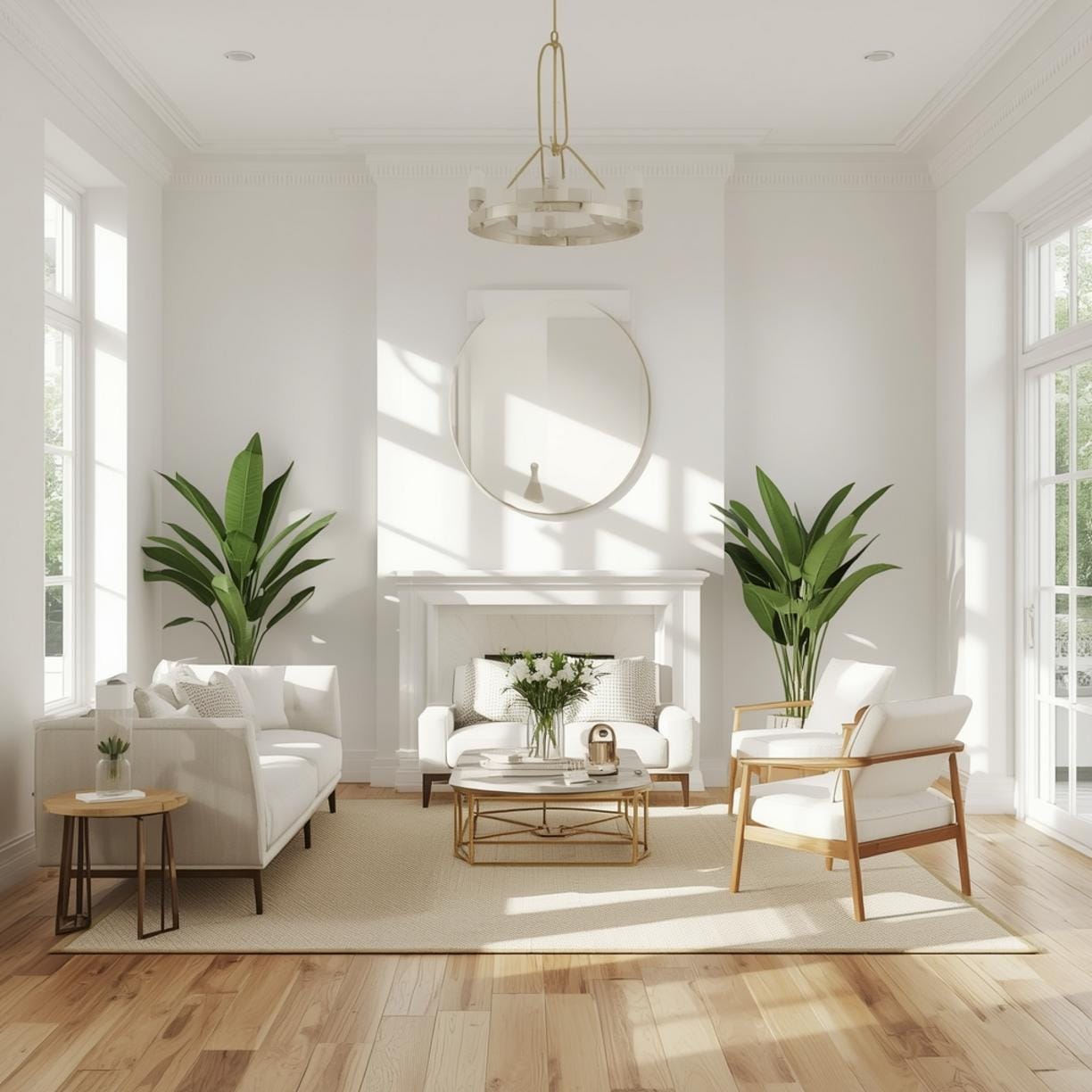
Classic Navy and Warm White:
Paint three walls in a soft, warm white and create an accent wall in rich navy behind your sofa. This combination works in traditional and modern spaces alike. Add navy pillows on a cream sofa and brass accents for warmth.
Soft Sage and Cream:
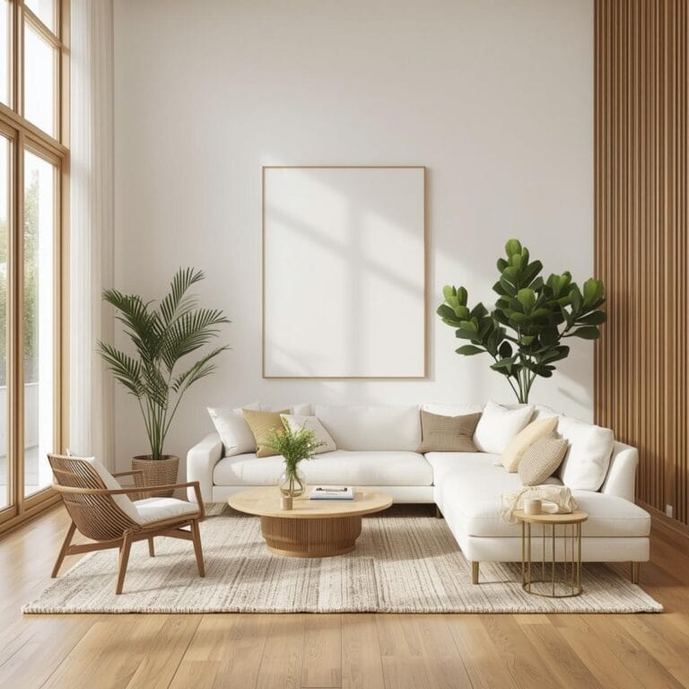
Use sage green as your main wall color with cream on trim and ceiling. This pairing brings the outdoors in and creates a naturally calming atmosphere. Layer in wooden furniture and woven textures for an organic feel.
Warm Gray and Dusty Rose:
Cover walls in a warm gray that has slight brown undertones, then introduce dusty rose through an accent wall, curtains, or upholstery. This sophisticated combination feels both modern and welcoming. It’s especially beautiful in rooms with good natural light.
Charcoal and Soft Gold:
For a dramatic yet livable look, paint walls in soft charcoal and use gold as your accent through metallic decor, picture frames, and pillow details. Keep furniture light-colored to balance the dark walls. How to choose complementary paint colors for small living rooms becomes easier when you understand that darker walls paired with lighter furniture actually make spaces feel larger by creating depth.
Powder Blue and White:
This airy combination feels fresh without being cold. Use powder blue on walls and crisp white on trim and ceiling. Bring in natural wood tones and white furniture for a coastal-inspired or Scandinavian aesthetic.
Terracotta and Cream:
Warm terracotta walls paired with cream accents create an inviting, earthy atmosphere. This combination works beautifully with leather furniture, woven baskets, and plenty of green plants. It’s perfect for rooms that feel too cold or stark.
Forest Green and Beige:
Paint walls in a muted forest green and use warm beige on an accent wall or through upholstery. This grounded combination feels sophisticated and works year-round. Add natural textures like jute, linen, and wood for a cohesive look.
Benefits of Thoughtful Color Pairing
A well-chosen color combination does more than make your living room look pretty—it changes how the space functions in your daily life.
Creates Visual Flow:
Two coordinated colors guide your eye naturally around the room rather than creating jarring stops and starts. This makes even smaller living rooms feel more spacious and intentional.
Simplifies Decorating Decisions:
Once you’ve committed to two main colors, choosing new pillows, artwork, or accessories becomes straightforward. You’re working within a defined palette that ensures everything coordinates without feeling matchy-matchy.
Improves Mood and Comfort:
Colors genuinely affect how we feel in a space. The right combination can make your living room feel more energizing, more relaxing, or more balanced—whatever your family needs from the space.
Increases Perceived Value:
A cohesive color scheme makes your entire home feel more polished and well-designed. This matters whether you’re planning to sell soon or simply want to enjoy living in a space that feels purposeful.
Adapts to Style Changes:
Working with two main colors lets you shift your decor style over time without repainting. Swap out accessories and accents while keeping your base colors constant.
Tips, Alternatives, and Styling Advice
Budget-Friendly Approach:
Keep walls neutral in an affordable white or greige, then introduce your two colors through less permanent elements like pillows, curtains, and artwork. A gallon of paint costs much less than repainting entire rooms, and you can change your scheme seasonally.
Mid-Range Option:
Paint one accent wall in your bolder color while keeping other walls neutral. Invest in one quality piece of furniture in your second color—a beautiful sofa or armchair. Add coordinating accessories gradually. This approach typically costs $300-600 including paint and a few key decor pieces.
Premium Choice:
Hire a color consultant for professional advice, then paint all walls in your carefully selected scheme. Invest in custom window treatments, quality upholstered furniture, and curated artwork that pulls both colors together perfectly. Budget $1,500-3,000 for a complete transformation.
Small Space Adaptation:
In compact living rooms, use your lighter color on most walls to maintain airiness. Add your darker or bolder color in small doses—one narrow accent wall, a single piece of furniture, or concentrated in your decor accessories. This keeps the room feeling open while still providing color interest.
Texture Matters as Much as Color:
Once you’ve chosen your two colors, vary the textures throughout the room. Smooth painted walls, nubby linen pillows, soft velvet upholstery, and woven baskets all in your color scheme create much more visual interest than flat color alone.
Common Mistakes to Avoid
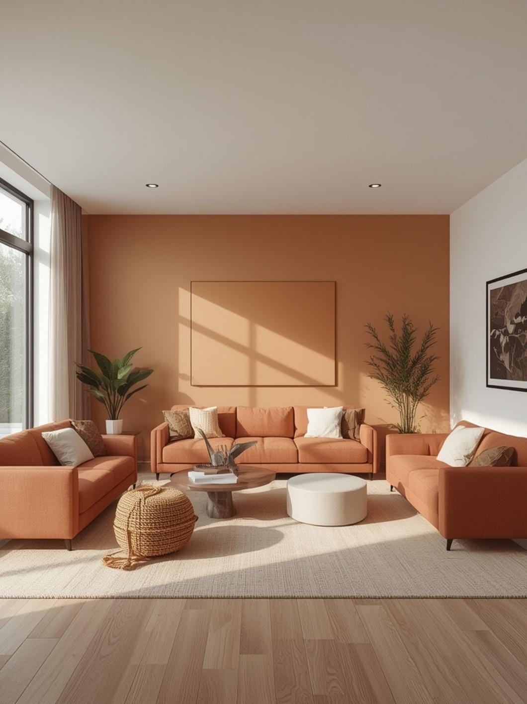
Using Equal Amounts of Both Colors:
This creates visual competition rather than harmony in your space. Instead, use your lighter or more neutral color on about 60-70% of surfaces and your accent color on the remaining 30-40%.
Ignoring Undertones:
Your “white” trim might have pink undertones while your gray walls lean blue, creating an unintentional clash. Paint large samples on poster board and view them together in your room’s lighting before committing.
Forgetting the Ceiling:
Many homeowners paint walls in their chosen colors but leave the ceiling basic white that doesn’t coordinate. Consider painting ceilings in your lighter wall color or a shade lighter to create cohesion.
Choosing Colors in Isolation:
Selecting paint colors at the store under fluorescent lighting rarely translates well to your home. Always test samples on your actual walls in your actual lighting for at least 24 hours before painting.
Neglecting Existing Fixed Elements:
Your living room already has permanent colors—flooring, fireplace brick, built-in shelving. Your two new colors must work with these existing elements, not fight against them.
Maintenance and Upkeep Tips
Maintaining your two-color living room keeps it looking fresh and intentional over time.
Touch Up Paint Regularly:
Keep leftover paint in labeled containers for easy touch-ups. High-traffic areas around doorways and furniture edges will show wear first. A quick touch-up every six months prevents your color scheme from looking tired.
Clean Walls Seasonally:
Dust and grime dull paint colors over time. Wipe walls with a barely damp microfiber cloth every few months, especially in your lighter color. This simple maintenance keeps colors looking vibrant.
Rotate Decorative Accents:
Switch out some accent pillows and decor items seasonally to keep your color scheme feeling fresh. You don’t need to change colors—just slightly different shades or patterns within your palette prevent visual boredom.
Protect High-Touch Areas:
Use washable paint in satin or semi-gloss finish near doorways, light switches, and behind seating areas. These finishes wipe clean easily without damaging your carefully chosen colors.
Update Lighting as Needed:
As bulbs burn out, replace them with the same color temperature throughout the room. Mixing warm and cool light bulbs can make your coordinated colors look mismatched, especially in evening hours.
Bringing It All Together
Choosing two colors for your living room isn’t about following strict design rules—it’s about creating a space that feels balanced, welcoming, and unmistakably yours. The combinations that work best are those that reflect how you actually live in the space, not just how they photograph.
Start with one color you absolutely love, find its perfect complement, and commit to the pairing throughout your room. Your living room will finally have that cohesive, intentional look you’ve been chasing.
Ready to explore more ways to make your living room feel complete? Discover more inspiring ideas and practical tips right here at DecorKingdom.
FAQs
What’s the easiest color combination for beginners to try first?
Warm gray paired with white is incredibly forgiving and works with almost any furniture style or decor. You can’t really mess it up, and it provides a neutral base that feels modern without being stark. Add warmth through wooden accents and textiles.
Should both colors be the same intensity or can one be darker?
One color should typically be lighter or more neutral to give your eye a place to rest. Using two equally bold or dark colors creates visual competition that makes rooms feel smaller and more chaotic. Aim for one dominant neutral and one accent color.
How do I know if my two colors actually go together?
Look at them in your actual room lighting at different times of day. If one color makes the other look muddy, dingy, or unpleasantly shifted, they’re not working together. Colors that complement each other will make each look better, not worse.
Can I use the same two-color combination in connecting rooms?
Yes, but vary which color dominates in each space to create distinction. Your living room might be mostly gray with blue accents, while your adjoining dining room could be mostly blue with gray accents. This creates flow while maintaining separate identities.
How often should I repaint or change my color scheme?
Most living room paint lasts 5-7 years before needing refreshing, but you might want to change colors every 3-5 years as your style evolves. Update your scheme when it no longer feels like “you” or when your furniture and decor can’t coordinate with it anymore.
—
Meta Title: Two Color Living Room Combinations That Work in 2026
Meta Description: Stop repainting! Discover two color combinations for living room spaces that create balance and style. Get 7 tried-and-true pairings now.